In today’s data-driven world, businesses need quick insights to make informed decisions. Retail sales data, when analyzed effectively, can provide powerful insights into customer behavior, product performance, and regional trends. One of the most efficient ways to visualize and analyze this data is by using an Excel dashboard.
A Retail Sales Excel Dashboard allows businesses to track key metrics like total sales, average sales, sales by region, and top-performing products or customers—all in one interactive view. This guide will walk you through what a retail sales dashboard is, why it’s essential, and how you can create one in Excel, with practical examples and real-life tips.
What is a Retail Sales Dashboard?
A retail sales dashboard is a visual interface that consolidates key sales data into charts, graphs, and metrics for easy understanding. Unlike raw spreadsheets, dashboards highlight trends, patterns, and exceptions, enabling managers to make faster decisions.
Key components of a retail sales dashboard typically include:
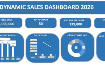
- Total Sales: The overall revenue generated in a period.
- Total Orders: Total number of customer orders.
- Average Sales per Order: Helps gauge customer purchasing behavior.
- Sales by Category: Shows which product categories are performing best.
- Sales by Region: Compares performance across different geographical areas.
- Top Customers & Cities: Identifies the highest-contributing clients and locations.
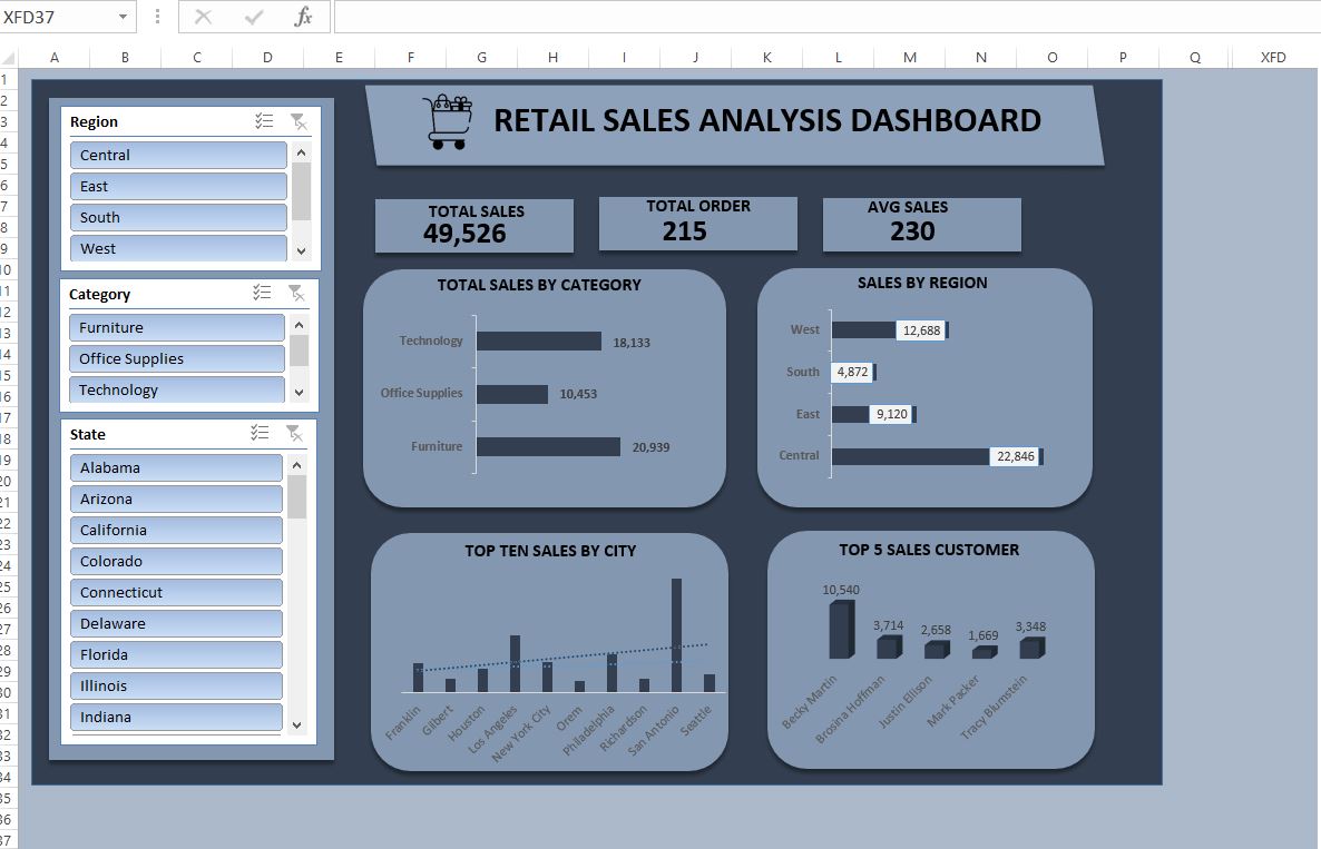
The example dashboard you shared clearly demonstrates these elements, making it an excellent template for businesses of all sizes.
Why Use an Excel Dashboard for Retail Sales?
While there are many BI tools like Power BI or Tableau, Excel remains a favorite for many small to medium-sized businesses. Here’s why:
- Accessibility: Most teams already use Excel, making adoption seamless.
- Flexibility: You can design dashboards exactly how you want.
- Cost-Effective: No need for expensive software licenses.
- Customizable: Easily add filters, slicers, and formulas for dynamic reporting.
- Real-Time Updates: Link dashboards to your sales data for continuous updates.
Step-by-Step Guide to Creating a Retail Sales Dashboard in Excel
Creating an effective retail sales dashboard in Excel involves several steps. Let’s break it down:
Step 1: Collect and Organize Your Data
Start by gathering your retail sales data. Key columns may include:
- Order ID
- Customer Name
- Product Category
- Region & State
- City
- Quantity Sold
- Unit Price
- Total Sale
Make sure your data is clean—no missing values, duplicates, or inconsistent formats. Using Excel Tables helps in organizing your data and makes it easier to reference in formulas.
Example Tip: Use separate sheets for raw data and dashboards to keep your workbook organized.
Step 2: Identify Key Metrics and KPIs
Your dashboard should focus on the most important metrics. Based on the uploaded dashboard, the key metrics are:
- Total Sales – Displays total revenue at a glance.
- Total Orders – Tracks the number of transactions.
- Average Sales – Helps analyze purchase behavior.
- Sales by Category – Highlights which products drive revenue.
- Sales by Region – Reveals geographical trends.
- Top Cities & Customers – Shows where the business is strongest.
Pro Tip: Use conditional formatting in Excel to highlight top-performing categories or regions. This instantly grabs attention.
Step 3: Create Charts and Visualizations
Visuals are the heart of any dashboard. Based on your dashboard image, here are the best types of charts to use:
- Bar/Column Charts: Great for comparing sales by region or category.
- Horizontal Bars: Ideal for showing total sales by product categories.
- Line Charts or Trend Lines: For monthly or yearly sales trends.
- Stacked Charts: Perfect for comparing multiple categories across regions.
Example: The dashboard uses horizontal bars to show sales by category and sales by region, making comparisons easier at a glance.
Step 4: Add Interactivity with Slicers and Filters
One powerful feature in Excel is the ability to filter data dynamically:
- Slicers for Region, Category, and State: Let users filter the dashboard to focus on a specific subset of data.
- Drop-down Filters: Allow selection of months, years, or product types.
This makes your dashboard interactive and more user-friendly. Users can quickly answer questions like:
- “Which region generated the most sales last quarter?”
- “Who are my top 5 customers for Technology products?”
Step 5: Design for Clarity
A dashboard should be visually clean and easy to read:
- Use a consistent color palette (like shades of blue and gray in the example dashboard).
- Keep charts and tables aligned and balanced.
- Use bold fonts for key metrics (Total Sales, Total Orders).
- Include icons or visuals for quick comprehension (e.g., shopping cart icon for sales).
Tip: Avoid clutter. Too many charts or numbers overwhelm the user. Stick to essential KPIs.
Practical Use Cases for Retail Sales Dashboards
- Track Regional Performance
Managers can instantly see which region is underperforming and take corrective actions. For example, in the dashboard:
- Central region leads in sales (22,846 units).
- South region lags behind (4,872 units).
Actionable insight: Launch targeted marketing campaigns in the South to boost sales.
- Monitor Product Category Performance
By analyzing sales by category, businesses can decide which products to promote or discontinue.
- Technology: 18,133 units
- Furniture: 20,939 units
- Office Supplies: 10,453 units
Actionable insight: Consider bundling Technology and Office Supplies to increase revenue.
- Identify Top Customers and Cities
Knowing your top customers helps improve retention strategies. For instance:
- Becky Martin generated 10,540 in sales, making her a priority client.
- San Antonio is the highest-selling city.
Actionable insight: Offer loyalty rewards or personalized discounts to top customers and cities.
- Optimize Sales Strategy
With insights from the dashboard, businesses can make data-driven decisions like:
- Adjusting inventory for high-demand products.
- Realigning marketing budgets toward profitable regions.
- Predicting future trends using historical data.
Tips for Creating a High-Impact Retail Sales Dashboard
- Keep it Simple: Focus on actionable metrics.
- Use Dynamic Charts: Link charts to tables for automatic updates.
- Highlight Trends: Add trend lines to spot seasonal patterns.
- Automate Calculations: Use formulas like SUMIF, AVERAGEIF, and VLOOKUP to reduce manual work.
- Test User Experience: Ensure the dashboard is easy for others to navigate.
Pro Tip: Add tooltips or comments in Excel cells to explain metrics for beginners.
If you need a Free Excel Stock Inventory Template, make sure to read my article as well. I have explained its features in detail, and it can help support your business — completely free of cost.
Final Conclusion:
A Retail Sales Excel Dashboard is a powerful tool for transforming raw sales data into actionable insights. By visualizing key metrics like total sales, sales by category, and top customers, businesses can make smarter decisions, optimize sales strategies, and enhance customer relationships.
Excel dashboards are not just charts—they are decision-making engines. With proper design, interactivity, and clarity, even small businesses can harness the power of data without investing in expensive BI tools.
If you’re serious about growing your retail business, building a sales dashboard in Excel is a practical, cost-effective step toward data-driven success.
FAQ:
What is a retail sales dashboard?
A retail sales dashboard is a visual representation of key sales metrics, allowing businesses to track performance and trends.
Which Excel charts are best for sales dashboards?
Bar charts, column charts, line charts, and stacked charts are ideal for visualizing sales data.
Can small businesses benefit from Excel dashboards?
Yes, Excel is cost-effective, flexible, and perfect for small to medium-sized businesses.
How often should I update my sales dashboard?
Dashboards should be updated weekly or monthly, depending on business volume.
What key metrics should I include?
Total sales, total orders, average sales, sales by region, sales by category, top cities, and top customers.