In today’s era, dashboards are in very high demand. If you know how to create a dashboard, it is extremely beneficial for you because every business needs a dashboard to track its performance easily and efficiently.
In this article, you will learn how to create an Excel Sales Dashboard. This dashboard is beneficial not only for business owners but also for students and freelancers. I have also provided a free template—so if you want to use this dashboard directly for your own business purposes, you can easily do so.
I am fully confident that after reading this article, you will be able to create a professional dashboard on your own.
If you prefer a ready-made version of this dashboard, you can get it for free. All you need to do is delete the existing dataset, enter your own data, and click refresh. The dashboard will automatically update according to your dataset.
Why Excel Dashboards Matter in 2026
In today’s data-driven world, businesses don’t just want numbers—they want insights.
A well-designed dashboard helps you:
- Monitor total sales and profit instantly
- Identify top-performing regions
- Analyze product performance
- Track sales trends over time
- Make faster business decisions
Instead of scrolling through thousands of rows, a dashboard presents everything in one place. If you’re working in sales, finance, operations, banking, insurance, or freelancing this skill is extremely valuable.
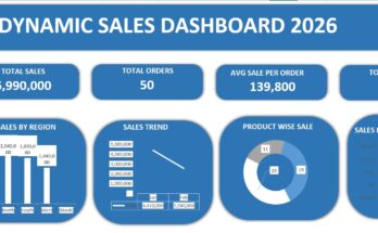
What We Are Creating (Overview of the Dashboard)
The dashboard in the image includes:
- Total Profit KPI
- Total Sales KPI
- Top Performing Region
- Top Selling Product
- Sales by Region (Column Chart)
- Sales by Product (Bar Chart)
- Sales Trend by Date (Line Chart)
- Sales vs Profit Comparison
- Product Contribution Pie Chart
- Interactive Slicers (Region, Product, Months)
This is a complete business reporting dashboard.
Step 1: Prepare Your Sales Data Properly
Before creating any dashboard, clean and structured data is essential.
What Your Raw Data Should Include:
Your dataset should contain:
- Date
- Region (East, North, South, West)
- Product (Laptop, Mobile, Tablet, Headphones)
- Sales Amount
- Profit
Each row must represent one transaction.
Important Tips:
- No blank rows
- No merged cells
- No unnecessary formatting
- Convert your data into an Excel Table (Ctrl + T)
Why convert to a table?
Because tables automatically expand when new data is added, making your dashboard dynamic.
Step 2: Create Pivot Tables for Analysis
Pivot Tables are the backbone of this dashboard.
Go to:
Insert → Pivot Table → Select your Table → New Worksheet
Now create different Pivot Tables for each analysis section.
Step 3: Create KPI Cards (Total Sales & Total Profit)
Total Sales KPI
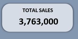
In Pivot Table:
- Drag Sales Amount into Values
- Set to Sum
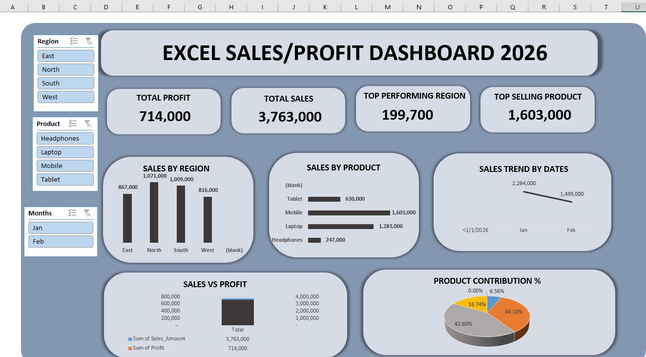
You will get total sales (like 3,763,000 shown in the image).
Total Profit KPI
- Drag Profit into Values
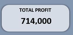 Set to Sum
This gives you total profit (714,000 in the example).
How to Design KPI Cards
- Insert Rounded Rectangle shapes
- Remove outline
- Add subtle shadow
- Use bold font for numbers
- Add label above (TOTAL SALES / TOTAL PROFIT)
This makes your dashboard look professional.
Step 4: Top Performing Region
To find the top-performing region:
- Put Region in Rows
- Put Sales Amount in Values
- Sort Largest to Smallest
The region with highest sales is your top region.

In the image, North has highest value (199,700).
You can display this in a KPI card or separate text box using:
=GETPIVOTDATA formula
This makes the result dynamic.
Step 5: Top Selling Product
Create another Pivot:
- Product in Rows
- Sales Amount in Values
- Sort descending
The highest sales product (like Mobile = 1,603,000 in image) becomes your top-selling product.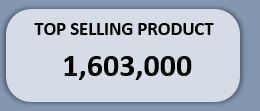
Display this in a separate card.
Step 6: Create Sales by Region Chart
Now let’s create the column chart.
From Pivot:
- Region → Rows
- Sales → Values
Insert → Column Chart
Format Tips:
- Remove gridlines
- Add data labels
- Use neutral color theme
- Increase font size
- Remove chart background
This gives a clean look like the image.
Step 7: Create Sales by Product (Horizontal Bar Chart)
Why horizontal?
Because product names are easier to read.
Steps:
- Product → Rows
- Sales → Values
- Insert → Bar Chart
Add data labels on right side.
This clearly shows which product is performing better.
Step 8: Create Sales Trend by Date (Line Chart)
Trend analysis is extremely important for business.
Create Pivot:
- Date (Group by Month)
- Sales Amount in Values
Insert → Line Chart
This helps answer:
Is sales increasing or decreasing?
In the image, sales dropped from January to February.
Businesses use this insight to plan promotions.
Step 9: Sales vs Profit Comparison
To compare performance:
- Add Sales and Profit both into Values
- Insert Column Chart
This shows relationship between revenue and profit.
Sometimes sales increase but profit decreases due to higher costs.
This chart helps detect such problems.
Step 10: Product Contribution Percentage (Pie Chart)
To calculate contribution:
- Product → Rows
- Sales → Values
Insert → Pie Chart
Add percentage labels.
This shows:
- Mobile contributes 42%
- Laptop contributes 34%
- Tablet contributes 16%
- Headphones contributes 6%
Management loves percentage insights.
Step 11: Add Slicers (Interactive Filters)
This is where your dashboard becomes powerful.
Select any Pivot Table → Insert → Slicer
Add slicers for:
- Region
- Product
- Month
Now connect slicers to all pivot tables:
Right click slicer → Report Connections → Select all pivots.
Now when you click:
- East → dashboard updates
- Laptop → dashboard updates
- January → dashboard updates
This is professional-level reporting.
Step 12: Design & Layout Like a Pro
Design matters as much as analysis.
If you are interested in a Habit Tracker, I am offering that free of cost as well. The Habit Tracker is designed in Google Sheets, and all its features are explained in the article. If you’d like, you can read about it and use it too.
Follow These Design Principles:
Use a single color theme
Keep spacing consistent
Align objects properly
Remove unnecessary borders
Use soft background color
Add a big dashboard title at top:
“EXCEL SALES/PROFIT DASHBOARD 2026”
This gives executive-level presentation.
Real-Life Use Cases of This Dashboard
This type of dashboard is used in:
Retail stores for tracking product sales
Banking for branch performance
Insurance companies for policy sales
E-commerce stores for monthly growth
Startups for investor reporting
If you’re a freelancer, you can sell this dashboard service on Fiverr or Upwork.
If you’re a student, this project looks impressive on your CV.
Common Mistakes to Avoid
Using raw data directly in charts
Not converting data to Table
Using too many colors
Cluttered layout
Not connecting slicers properly
Ignoring data cleaning
Clean data + clean design = professional dashboard.
Advanced Improvements (Optional)
Once comfortable, you can:
Use Power Query for automation
Add dynamic titles
Add conditional formatting
Use sparklines
Create dynamic ranking
These upgrades make your dashboard even stronger.
Why This Skill Is Valuable in 2026
Companies don’t just want Excel users.
They want:
Data thinkers
Business analysts
Decision supporters
Dashboard creation shows:
Analytical thinking
Business understanding
Technical Excel skill
Presentation ability
This is why dashboard skills increase job opportunities.
Conclusion
Creating an Excel Sales Dashboard in 2026 is not just about charts it’s about storytelling with data. With Pivot Tables, Charts, KPI Cards, and Slicers, you can transform simple sales data into powerful insights.
The dashboard shown above demonstrates:
Clear KPIs
Visual comparisons
Trend analysis
Interactive filtering
Professional layout
Once you build this once, you’ll realize how powerful Excel truly is.
Start small, practice consistently, and soon you’ll be creating dashboards that look corporate-level.
Your data deserves to be understood not just stored.
Frequently Asked Questions (FAQ)
Q: Do I need advanced Excel skills to create this dashboard?
A: No. Basic knowledge of Pivot Tables, Charts, and Slicers is enough to build this dashboard.
Q: Can I create this dashboard in Excel 2016 or older versions?
A: Yes, but slicers and some design features work better in Excel 2016 or newer.
Q: How often should I update the dashboard?
A: If your data is dynamic, you can refresh it daily, weekly, or monthly depending on business needs.
Q: Can I use this dashboard for interviews or portfolio?
A: Absolutely. Recruiters appreciate practical dashboard projects.
Q: What is the most important part of dashboard creation?
A: Clean data and clear layout are more important than fancy colors.
Q: Can I automate data updates?
A: Yes, using Power Query or connecting to databases.
Q: Is Excel dashboard better than Power BI?
A: Excel is great for small to medium data. Power BI is better for large, complex datasets.