In today’s time, decision-making has become very smart. This is because founders and CEOs no longer rely on long traditional reports. Instead, they make business decisions based on a one-page report, which is usually a dynamic dashboard.
It is not necessary that a dashboard must be created only in Excel. When dealing with big data, data analytics is often done in Power BI, which can create even better reports than Excel. Excel can still do almost everything, but handling very large datasets in Excel can be difficult because the file may become slow or even crash.
In today’s article, we will learn how to create a simple Sales Dashboard in Excel, with a step-by-step guide.
What is a Sales Dashboard?
A sales dashboard is a visual representation of your sales data. It consolidates multiple metrics into a single interface so that managers, sales teams, and business owners can:
- Track sales performance
- Monitor targets and achievements
- Identify top-performing products and regions
- Make informed decisions in real-time
In Excel, dashboards can combine KPIs, charts, tables, and slicers to make the data interactive.
Why Use Excel for Your Sales Dashboard?
Even with advanced BI tools available, Excel remains one of the most versatile platforms for creating dashboards because:
- Accessibility: Almost everyone has Excel installed, making it easy to share dashboards.
- Flexibility: You can create custom KPIs, charts, and slicers without coding.
- Interactivity: With features like PivotTables, slicers, and conditional formatting, your dashboard becomes dynamic.
- Cost-effective: No need for expensive software subscriptions.
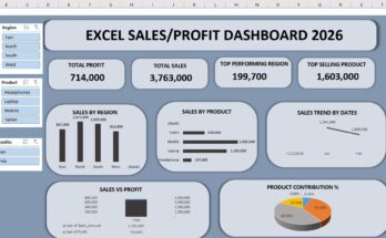
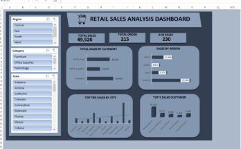
Key Metrics (KPIs) to Include in Your Sales Dashboard:
When building a sales dashboard, including the right KPIs (Key Performance Indicators) is crucial. Based on the example dashboard we have, here are some essential metrics:
- Total Sales – Shows your overall revenue.
- Total Orders – Total number of orders received.
- Average Sale Per Order – Helps identify the average revenue generated per order.
- Total Units Sold – Measures product volume.
- Sales by Region – Compares sales performance across different regions.
- Sales Trend – Displays monthly or quarterly sales trends.
- Product-wise Sales – Highlights which products are contributing most to revenue.
- Salesperson Performance – Shows individual performance for better accountability.
These metrics allow you to quickly spot trends, strengths, and areas that need attention.
Step-by-Step Guide to Creating a Dynamic Sales Dashboard in Excel:
Step 1: Collect and Organize Your Data
Before building a dashboard, ensure your sales data is clean and structured. A typical dataset should include:
- Date of sale
- Product name
- Salesperson
- Region
- Units sold
- Sale amount
Tip: Use a structured table in Excel (Ctrl + T) to make data management and filtering easier.
Step 2: Create PivotTables for Core Metrics
PivotTables are the backbone of dynamic dashboards. Here’s how to set them up:
- Insert PivotTable:
- Select your sales data → Insert → PivotTable → choose a new worksheet.
- Set up KPIs:
- For Total Sales: Drag “Sale Amount” to Values → Summarize by Sum.
- For Total Orders: Drag “Order ID” to Values → Summarize by Count.
- For Units Sold: Drag “Units Sold” to Values → Summarize by Sum.
- Use Slicers for interactivity:
- Insert → Slicer → Choose fields like Region, Salesperson, Product.
- Connect slicers to your PivotTables to filter multiple KPIs simultaneously.
Step 3: Design Your Dashboard Layout
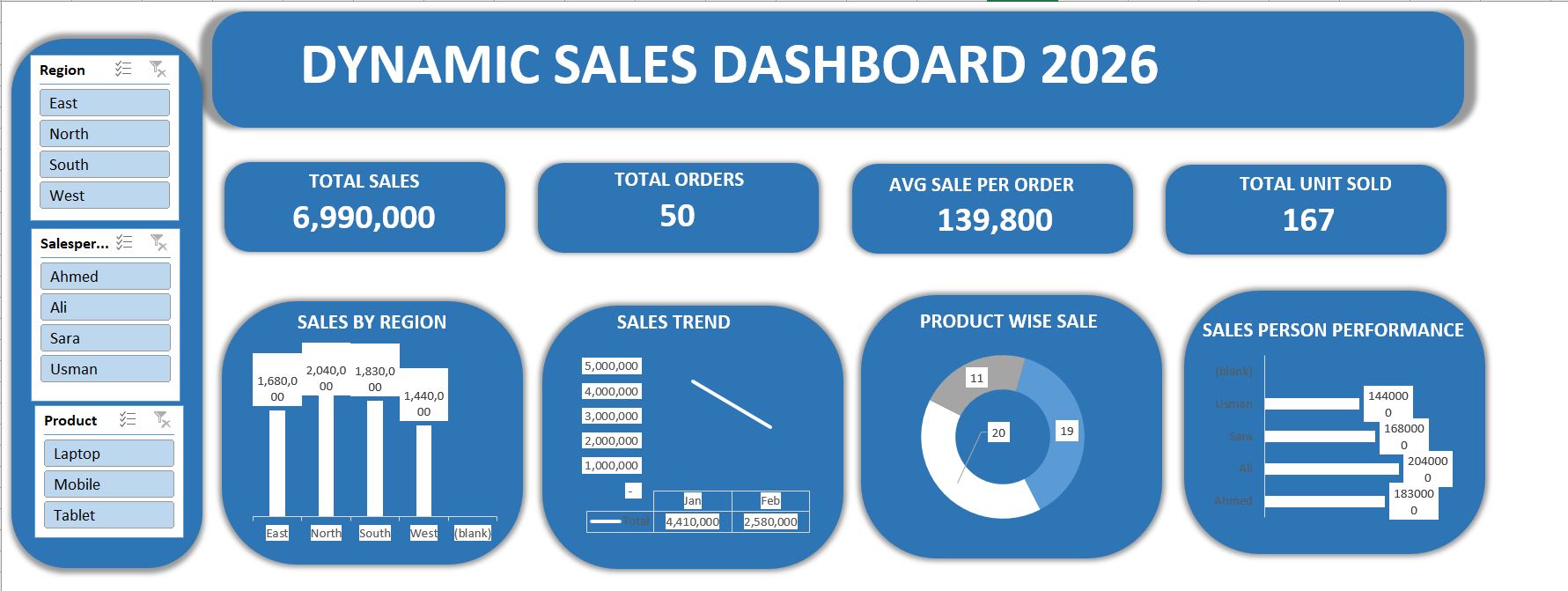
Use your example dashboard as a reference:
- Top Section: Display Total Sales, Total Orders, Avg Sale Per Order, Total Units Sold in large, bold numbers.
- Middle Section: Include Sales by Region and Sales Trend charts.
- Bottom Section: Add Product-wise Sales and Salesperson Performance visualizations.
Design Tips:
- Use rounded shapes or background panels to highlight each KPI.
- Stick to 2–3 brand colors for a professional look.
- Keep charts simple and readable; avoid clutter.
Step 4: Add Charts for Visual Insights
Excel offers multiple chart types. Based on our dashboard example:
- Sales by Region – Column or Bar Chart to compare regions.
- Sales Trend – Line Chart for monthly/quarterly sales.
- Product-wise Sale – Doughnut or Pie Chart for product contribution.
- Salesperson Performance – Horizontal Bar Chart for individual comparisons.
Pro Tip: Label each chart clearly, and use data labels to make values visible without hovering.
Step 5: Make Your Dashboard Dynamic with Slicers
Slicers allow users to filter data interactively. For instance:
- Filter by Region to see which areas are performing best.
- Filter by Product to analyze product-specific sales.
- Filter by Salesperson to measure team performance.
This functionality transforms a static dashboard into a real-time analysis tool.
Step 6: Add Conditional Formatting
Conditional formatting highlights trends and anomalies. Use it for:
- Highlighting top-performing regions or salespeople.
- Color-coding sales trends (green for increasing, red for decreasing).
- Showing low-performing products in contrasting colors.
Step 7: Test and Refine Your Dashboard
Before finalizing:
- Check that slicers filter all relevant charts and KPIs.
- Ensure data is accurate and numbers match source data.
- Keep your layout clean and intuitive.
Tip: Ask colleagues for feedback to improve readability.
Real-Life Use Case: How Businesses Benefits:
Consider a regional sales team using this dashboard:
- The manager quickly sees that the North region generated the highest sales (2,040,000) while the West lagged behind (1,440,000).
- Sales trend analysis shows January sales peaked at 4,410,000, dropping in February.
- Product-wise insights reveal Laptops are the top sellers, allowing the team to focus marketing efforts strategically.
- Salesperson performance helps reward top performers like Ali (204,000) and identify areas for coaching.
This is exactly the type of actionable insight a good sales dashboard provides.
Tips for a Professional Excel Sales Dashboard:
- Keep It Simple: Focus on essential KPIs, avoid overloading with charts.
- Use Interactive Elements: Slicers and drop-downs increase usability.
- Automate Updates: Link PivotTables to your master data table.
- Visual Hierarchy: Place the most important metrics at the top for instant insights.
- Document Your Dashboard: Include a hidden sheet explaining data sources and calculations.
Suggested Visual Enhancements:
- Add icons next to KPI numbers (e.g., trending arrows).
- Use shading or background panels to separate sections visually.
- Include sparkline charts in cells for micro-trends.
- Use dynamic titles that change with slicers (e.g., “Sales for Region: North”).
If you would like to use my Professional Sales Dashboard in Excel (2026), you can download it easily. It is completely free of cost.
You can use it for your freelance work or business projects, and you can also practice with the dataset included in the dashboard to improve your Excel skills.
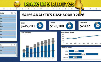
If you would like to read another article related to Excel dashboards, you can check out my detailed guide: “Make an Interactive Excel Dashboard in Just 9 Minutes (2026)”.
In this article, I explain how to quickly build an interactive Excel dashboard with simple steps, making it easier for beginners to understand and practice dashboard creation.
Final Words:
We have seen how an Excel Dashboard is created and what an Excel dashboard actually is, along with its usage. We also looked at key metrics, such as total sales, and learned how to prepare region-wise sales data and design the dashboard layout.
A real-time example was also shared so you can understand how dashboards are used in real situations. In the end, I would like to say that the more you practice, the more expert you will become, because practice makes you perfect.