If you have a ready dataset and you want to design it into a beautiful dashboard, and your boss has given you the task to create an Excel dashboard, what would you do?
With the help of this article, today you will learn how to create an interactive Excel dashboard in just 9 minutes.
Why is it important to create a dashboard? Creating a dashboard is important because all your business records are presented on one page in graphical form, which helps stakeholders in decision-making.
If you don’t understand anything, you can ask in the comments. You can also visit my YouTube channel, Dani Insights, to watch the complete tutorial of this dashboard. I hope you will learn something new.
Why You Need an Interactive Excel Dashboard
Before diving into the steps, let’s understand why interactive dashboards are game-changers:
- Real-Time Decision Making: Visual dashboards make it easier to interpret complex datasets quickly. Instead of analyzing raw tables, you can instantly spot trends, like sales growth or customer engagement patterns.
- Improved Reporting: Interactive dashboards reduce manual reporting. With slicers and charts, a single dashboard can answer multiple business questions.
- Enhanced Collaboration: Shareable Excel dashboards allow teams to track performance metrics together, promoting data-driven decisions.
- Time-Saving: With automation and interactivity, managers can view monthly, regional, or product-specific insights without repetitive calculations.
Step-by-Step Guide to Creating a Dashboard in 9 Minutes
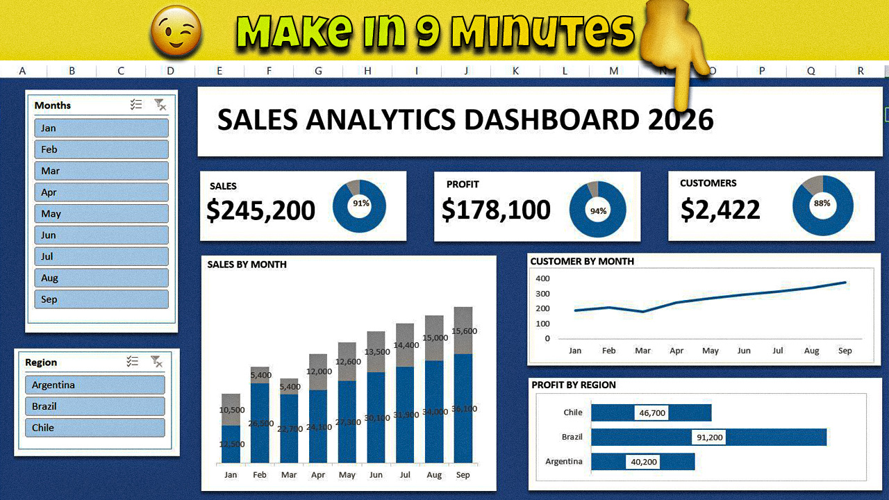
Here’s how to recreate a professional Sales Analytics Dashboard similar to the one in the image.
Step 1: Prepare Your Data
Start by organizing your raw sales data. A clean dataset typically includes:
- Month (Jan, Feb, Mar…)
- Region (e.g., Argentina, Brazil, Chile)
- Sales (numeric values)
- Profit (numeric values)
- Customers (numeric values)
Tip: Always ensure your data has no empty rows and all numbers are formatted consistently.
Step 2: Insert Pivot Tables
Pivot Tables are the backbone of Excel dashboards. They help summarize large datasets without writing formulas manually.
- Go to Insert → PivotTable.
- Select your data range.
- Drag fields into appropriate areas:
- Rows: Month
- Columns: Region (optional)
- Values: Sales, Profit, Customers
This will create a summarized view, ready to be visualized in charts.
Step 3: Add Interactive Slicers
Slicers make your dashboard interactive:
- Click your Pivot Table → Insert Slicer.
- Choose Months and Regions as slicers.
- Place them on the side for easy filtering.
Pro Tip: In the sample dashboard, the slicers allow users to filter by month or region instantly, updating all charts simultaneously.
Step 4: Create Key Performance Indicators (KPIs)
KPIs highlight the most important metrics at a glance. For our example:
- Sales: $245,200
- Profit: $178,100
- Customers: 2,422
Use card-style visuals in Excel:
- Select a cell with the total.
- Apply bold font, borders, and background color.
- Add data labels or doughnut charts to represent percentages (e.g., Sales target achieved).
Step 5: Build Charts for Deeper Insights
Charts make your dashboard engaging and insightful. For example:
5.1 Sales by Month (Stacked Column Chart)
- Visualizes monthly sales trends and compares multiple regions.
- Stack actual sales vs. target sales using different colors.
- Add data labels for exact values (e.g., 36,100 in September).
5.2 Customer Growth (Line Chart)
- Shows the number of customers per month.
- Helps track engagement and conversion trends.
- Useful for forecasting future sales potential.
5.3 Profit by Region (Horizontal Bar Chart)
- Compares profits across regions.
- Quickly identifies top-performing and underperforming regions.
- Simple, yet powerful, for executive presentations.
Step 6: Apply Dashboard Formatting
Formatting makes dashboards user-friendly:
- Background: Use subtle, soft colors (like blue shades) for professionalism.
- Borders & spacing: Group charts and KPIs into sections.
- Fonts: Stick to readable fonts like Arial or Calibri.
- Alignment: Align KPIs horizontally for a clean look.
- Highlighting: Use color coding for trends (green for growth, red for decline).
Tip: In our example, the dashboard uses a blue background with white cards for KPIs, giving a modern and clean look.
Step 7: Test Interactivity
Check all slicers and filters:
- Clicking Feb should update all charts for February.
- Selecting Brazil should show only Brazilian data in all charts.
- Ensure data labels are still visible and readable.
Step 8: Add Dynamic Elements
- Percentage rings: Display KPI progress dynamically.
- Conditional formatting: Highlight months with highest sales or lowest profits.
- Dynamic titles: Use formulas like =”Sales Overview for “&Slicer_Selection to make titles adjust automatically.
Step 9: Save and Share
- Save your dashboard as .xlsx for interactivity.
- For sharing with colleagues who don’t have Excel:
- Export to PDF (static version)
- Use PowerPoint screenshots for presentations
- Embed in SharePoint or Teams for collaboration
Real-Life Use Cases
I don’t have real-life cases, but you can assume that if you are working in a sales team and your team leader asks you to create a dashboard to track sales performance — such as the top-selling region, top 10 salespersons, which product sold the most, and which city had the highest sales — then you can easily track all these things through this dashboard.
Scenario 2: Assume that you are a freelancer and your client provides you with a sales dataset along with instructions to track sales performance, etc. In that case, you can easily create a dashboard for them and deliver it professionally.
Scenario 3: If you have your own business and you want to track your sales, you can create a dashboard for yourself. You won’t need to pay anyone or hire a freelancer — you can build your own dashboard easily.
Tips for Beginners
- Start with small datasets; complexity can be added gradually.
- Use PivotTables first; avoid manual formulas.
- Keep charts simple: clarity > decoration.
- Regularly update source data to keep dashboards accurate.
- Save a template dashboard for repeated use.
Conclusion:
So, in this complete guide, we learned how to prepare the dataset, format it properly, create slicers and charts using Pivot Tables without any complex formulas, and design a clean and effective dashboard layout.
In this way, an Excel dashboard helps you in decision-making. It improves reporting and gives you a professional presentation edge.
Start practicing from today. Take any sample raw dataset — you can find free datasets on platforms like Kaggle, YouTube, or you can even generate a free sample dataset with the help of AI. I personally use this method for practice.
The more you practice, the faster you will learn — and you will truly enjoy creating dashboards. I’m saying this with full confidence.